|
Temperature
and Migration: Looking Back at March 2008
(Teachers:
Map is hotlinked for larger projection on smartboard or screen.)
|

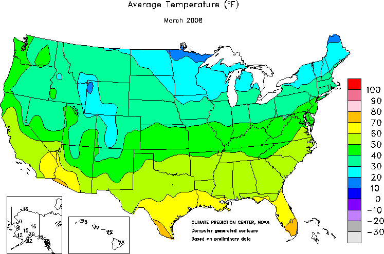
Average
Temperature
|

The
Migration |
The map on the left shows the average temperature over the full
month of March. The map on the right shows the monarch's migration
through April 4th. Compare the two maps and think about how spring
temperatures and migration might be related.
|
| Describe
the pattern you see on the temperature map: |
| In
what ways is the migration map similar to the temperature
map? |
In
what ways is the migration map different from the temperature
map? |
What
might be causing the similarities you see between migration and
temperatures in March? What might be causing the differences?
|