|
Analyzing
the Whooping Crane Population Data
| 
Click
graph to enlarge
|
How is
the world's last remaining natural migratory flock of Whooping cranes
doing? The population figures in the table below show the growth
of this flock.
Activity:
Make Three Graphs
Show changes in the population
levels for the only natural migratory flock (the Aransas/Wood
Buffalo/Western flock) of this endangered species. Use the
population data below to
make
3 graphs:
- The number of
Whooping Cranes per year.
- The increase
in the number of Whooping Cranes per year.
- The percent increase
in the number of Whooping Cranes per year.
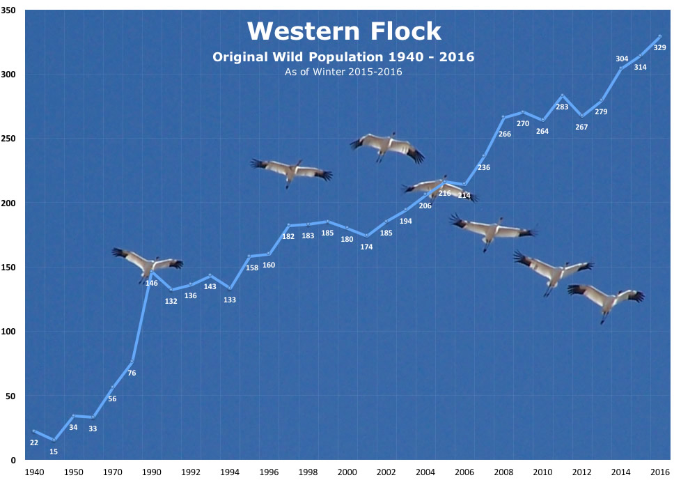
Population
of Whooping Crane Natural Flock (Aransas/Wood Buffalo Flock)
1940-Present* (after fall migration)
| Year |
#
Cranes |
Year |
#
Cranes |
| 1940 |
22
|
2001 |
174 |
| 1950 |
34
|
2002 |
185 |
| 1960 |
33
|
2003 |
194 |
| 1970 |
56
|
2004 |
216 |
| 1980 |
76
|
2005 |
218 |
| 1990 |
146
|
2006 |
237 |
| 1991 |
132
|
2007 |
266
|
| 1992 |
136
|
2008 |
270
|
| 1993 |
143
|
2009 |
263
|
| 1994 |
133 |
2010 |
281
|
| 1995 |
158 |
2011 |
*245 +?
|
| 1996 |
160 |
2012 |
**279 |
| 1997 |
182 |
2013 |
***304 |
| 1998 |
183 |
2014 |
314 |
| 1999 |
185 |
2015 |
329 |
| 2000 |
177 |
2016 |
|
*The winter 2011-12 count presented many challenges to getting an accurate total. Warm weather and extreme drought conditions on the Texas wintering grounds in winter 2011-02 are believed to have caused much wider dispersal of cranes, making a direct count difficult. Whoopers that normally remain on or near Aransas NWR were detected in Nebraska, Kansas, Oklahoma, and eight counties in Texas. Officials had hoped for 300 Whooping cranes to migrate south after the 2011 breeding season in Canada.
**The winter 2012-13 count was not finalized until March 2013, and it was based on a new method. Bologists at Aransas NWR have switched from direct count to estimates.
***In December 2013 the peak population size of the western flock on the primary wintering grounds was estimated as 304 birds (95% confidence interval [CI] 260–364), and additional birds were located outside the survey area. Whooping cranes faced challenging conditions due to forest fires during the 2013 breeding season and continued drought during the wintering season Texas.
Try
This! Discussion or Journaling Questions
- After
making your 3 graphs, describe the different visual picture each
graph gives
you. Was it helpful to graph the data in these different ways?
- Think
about what each graph means. What different information does each
graph show
you? Give each graph a title.
- Which graph do
you think is the most revealing?
- Are there times
when the numbers appeared to increase significantly, but the percentage
increase was not as pronounced?
- What
questions did the graphs make you think of about the climb in
population size?
- What
reasons do you suppose are behind these population changes? List
all the factors you can think of that might have caused the population
to rise (or
fall) as the data show.
- During
which decade did the population increase at the fastest rate?
Which year did it increase the most?
|