Graphing Photoperiod:
A Different Approach
In addition to using the Journey North line graph (which lets you see photoperiod lines for all ten mystery sites plus your location all at once), two teachers have shared how they also use a separate graph format too.
Instead of using lines to show photoperiod, this additional graph format uses "spaces" to show the hours in a day. Students darken the spaces before sunrise and after sunset, so that the resulting "light" spaces give an interesting picture of the day, the night and the changing photoperiod at that location. Here are two graph examples from teacher Susan Fineman's students, who made them on graph paper:
|
 |
Susan uses this alternate graph from the beginning of the school year, and then uses it for the Mystery Classes too, as a way to show two formats of graphing the same data. Her helpful comments are below.
Fourth grade teacher Deborah DeCoux from Jollyville Elementary School in Austin, TX also uses this additional graph format. She has created a printable form for this alternate graph.
|
 |
Morningside School
Grade 7
Pittsburgh, PA
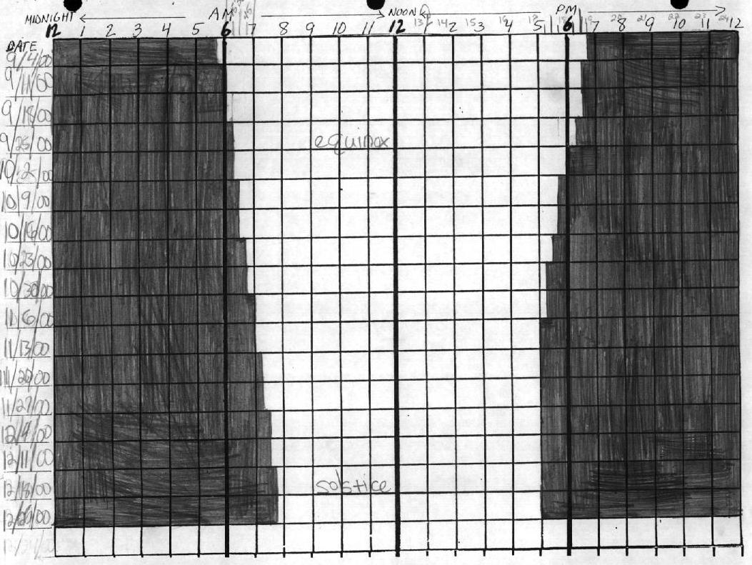
We calculate our local photoperiod each week from the beginning of the school year, and then graph the sunrise and sunset times on 24-cm wide grid paper, one row per week. The graph gives an interesting picture of the changing photoperiods and the place of the solstices and equinoxes.
The Pittsburgh Suntimes graph we keep all year is done on centimeter grid paper that has 24 boxes per row. We number the vertical lines from 0 to 2400. For a given week we write the date to the left of the row in the margin.
We round the sunrise time to the nearest quarter hour, plot that time with a vertical line, and shade in the boxes from 0 to the sunrise time. For sunset we plot the time rounded to the nearest quarter hour and shade the row from the sunset time to the 2400, the end of the row. The unshaded boxes represent the photoperiod and can be used to check photoperiod calculations.
As the weeks stack down the page from the beginning of school on, the
graph shows the days shortening from both ends till solstice time. The
weeks around the solstice show the unchanging sunset times (or sunrise
for the June solstice) and then the increasing photoperiods.
I had been doing this for years to help the kids gain familiarity with the phenomenon,
and make inroads to undo their misconceptions about what causes seasons. I was
heartened to discover that the Everyday Math program my district adopted does
a similar activity in third grade with a huge chart marked so the class can plot
the sunrise and sunset times to the nearest two minutes. The wider scale makes
a more curvacious graph.
When Journey North starts, each student continues tracking Pittsburgh's
suntimes in addition to one mystery class's suntimes. The student graphs
the weekly photoperiods for both places in the Journey North graph format
using one symbol for Pittsburgh and another for the mystery class.
This approach shows the kids two ways of graphing the same data and reinforces
the graphing skills taught in our math program (Connected Mathematics Project).
The comparison of Pittsburgh photoperiods and changes with those of one mystery
class made by each child stimulates many insights and excellent class discussions.
We also make the big graph of all 11 classes' photoperiods by taping together
two sheets of chart paper and using a different color marker for each class.
Students are fascinated by the patterns the graphs show. When it's all over and
I bring out the big graphs I've saved from other years' mysteries, the kids pour
over them guessing where those mystery classes must have been.
If
you have tips you'd like to share, please write to Journey North: jnorth@learner.org
© 1997 – 2025 Journey North. All rights reserved.