Does
Spring Journey North?
Mapping the Green Wave of Spring
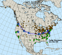
Journey North uses Tulip Test Gardens to indicate the greening of spring
throughout the country. But here's a question to ponder:
"Does spring truly move northward?"
Map
the Data
On
your own Journey North Maps, use dots to add new tulip garden data each
week showing where tulips have emerged and bloomed. Describe the pattern
you begin to see.
- What direction(s) is spring moving? Does anything surprise you?
- How would you explain what you see?
- What do you think will happen next?
Imagine drawing the wave of spring at different stages over the next weeks as spring moves across the continent. These lines are called "isopleths." You can see an example to the right which shows places that have the same temperatures on a certain date.
Map the Wave with Mapserver
- Select dates using the Mapserver date scroll. Start in January and continue reviewing maps for each successive week.
- Print a map each week and circle all the test gardens that have emerged (or bloomed).
- Draw a line that more or less connects these dots.
- Repeat this each week until the wave of spring has advanced across the entire region.
Display your maps in your Journey North learning center.
Journal Questions
- What patterns do you notice? How would you explain them?
- What general statement can you make?
- Did anything surprise you? What questions do you have?
Digging
Deeper
Try to
complete this statement:
"Spring green advances at the average rate of XX miles per week."
Hint: To figure this out, measure the distances between the waves on your map. Then use the map's scale to figure out the actual distances. To get an average, add these up and divide the total miles by the number of lines you drew.


